Box 'n' Gift: Small report
Here you will find back a description of the idea and design of our e-commerce website. This website has been designed as a task for E-business in the European Union, taught at Artevelde University College.
Idea
After much consideration we have decided to go for a web shop where people can buy fun and exciting gifts and we will combine them in fun packages. We want to offer a wide variety so people can freely adapt their presents to the personalities of their family, friends or loved ones. There will be specials throughout the year. We have decided that every big holiday there will be specialized products for the season, for instance: Christmas, mother’s day, father’s day, ...
We have also investigated the different types of website builders. Wix gave us the most options and a more professional look then the other possibilities. The free version already gives us plenty of different subpage options. This way we could add a blog about our products or create more options for the different products such as sizes or different prices for the gift cards. There are a couple of downsides to Wix. The price for a website without advertising and it’s own URL is a little higher than the others. It isn’t as user-friendly as Weebly and takes a bit more time to put together. This is however canceled out by the bigger possibilities to make the site more intricate and personal. The url of our site is: http://birghell.wix.com/boxngift
At this moment we won’t be paying for the site so we will be having Wix advertising and this URL. If this were an actual real-life business we would pay the fee required by Wix to remove the advertising and a personalized URL. We have also started a Facebook page (https://www.facebook.com/boxngift?fref=ts), Twitter account (https://twitter.com/BoxnGift1) and Pinterest (http://www.pinterest.com/Boxngift/).
Design
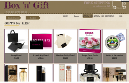
Color and overall site design
Our site has a calm and homely feel to it so customers feel comfortable when they access the site. Every page has the banner with the name of our web shop and the slogan. The banner also shows our policy where shipping is free for orders over 49 €. In the right corner above the banner we have decided to show the cart. By doing this customers will be able to see the items they might want to buy, even if they want to see about the shipping policies or contact page. Underneath the banner we have the tabs to different pages. At this time we have 5 different pages in the website: Home, Boxes, gifts for her, gifts for him and contact us. At the bottom of the page there are shop guarantees: money back, 100% secure ordering and our privacy policy. We also have links installed on this page to our shipping and return policies. Lastly there are links to our Facebook page, Twitter, Instagram and Pinterest.
The colors we have selected are violet, grey and brown. These colors give us a professional look and we think they will be pleasing to the eye. There is some debate to adapting the colors during certain holidays such as red, green and gold for Christmas, but we haven’t decided this yet.
Home page
For the home page we have started with a short welcoming text explaining what this site is all about. This short text gives customers an idea of how they can order their gifts and the different seasons. This welcoming will stay the same but underneath we have a changing section. Here we will place products with 10% off. These offers will change every month and display 2 gifts for her and 2 for him with a reduction. During special seasons there will be a display of 8 gifts adapted for that season with a link to our holiday page. We have designed our home page this way to ensure that people will get interested in the different products on the following pages.
Boxes
The boxes subpage shows the different types of wrapping we offer. At this moment the options are limited to gift basket, gift wrapping, simple box and special box. When customers click on one of these options they can see a short description and sales pitch of the item and in some cases they can chose a size. With the simple box they can pick: S (2 items), M (2-4 items), L (4-6 items) and XL (6+ items).
For HER
For Her is a page that contains the complete offering of our products for the female gift receiver. This page contains perfumes, gift boxes and other fun gifts. Each gift is featured on this page with a picture, the name of the product and the price. When you click on a product the picture is on the left. You can some in and move over the pictures to get more details. Some gifts have multiple pictures. On the right is all the important information. The name with underneath a description and the price. Our gift cards have multiple price options. This is followed by the add to cart button. There are also products that have specifications at the bottom such as volume, measurements ... We also give people the option to pin, tweet and Facebook about our products.
This way gift receivers can hint to the givers which gifts they would like in their baskets. It also creates a way for us to spread the word about our sites. If people share our products from the site it will lead other people back to us.
For HIM
The for him page is set up mostly similar to the for her page. Here we have used the same way to display the products on the overall and specific subpages.
Cart and thank you page
Our cart is designed to give a clear overview of its content. By using columns we can easily list the product, quantity and total price of each different order. The quantity can be adapted here. At the end there is also a remove button if customers wish to delete a certain item from their gift box. It is annoying when shipping costs are not clearly state and this creates a stop moment for customers. To deal with this problem we have put a shipping fee calculator between the item listing and the total cost. This way we give a clear calculation of the price.
When the item selection and buying process has completely run customers get a thank you for your purchase page. This has been designed to let customers know when they have safely completed the payment process and states the delivery time of the order. There will also be an e-mail with an order tracking code.
Contact us
The last page of this e-commerce site is an information page. At it has a contact form and the company information. This way customers can contact us with questions. The links at the complete bottom of the page lead back to this subpage. It contains all the information on the shipping and delivery, return policy, order tracking, money back guarantee, secure ordering and our privacy policy. By providing all of this information on one page it will be easy for customers to find the answers to their questions.
Social media
We have also decided to set up different social media for our website. This will help us with our e-commerce marketing strategy. We want to create a lot of content on Facebook, Twitter and Pinterest. By creating our own posts and updates we will work on our SEO. Next to that there will be traffic created by our customers when they share products on Facebook or pin them on Pinterest. We have agreed that there will be weekly updates on these sites about new products.
Idea
After much consideration we have decided to go for a web shop where people can buy fun and exciting gifts and we will combine them in fun packages. We want to offer a wide variety so people can freely adapt their presents to the personalities of their family, friends or loved ones. There will be specials throughout the year. We have decided that every big holiday there will be specialized products for the season, for instance: Christmas, mother’s day, father’s day, ...
We have also investigated the different types of website builders. Wix gave us the most options and a more professional look then the other possibilities. The free version already gives us plenty of different subpage options. This way we could add a blog about our products or create more options for the different products such as sizes or different prices for the gift cards. There are a couple of downsides to Wix. The price for a website without advertising and it’s own URL is a little higher than the others. It isn’t as user-friendly as Weebly and takes a bit more time to put together. This is however canceled out by the bigger possibilities to make the site more intricate and personal. The url of our site is: http://birghell.wix.com/boxngift
At this moment we won’t be paying for the site so we will be having Wix advertising and this URL. If this were an actual real-life business we would pay the fee required by Wix to remove the advertising and a personalized URL. We have also started a Facebook page (https://www.facebook.com/boxngift?fref=ts), Twitter account (https://twitter.com/BoxnGift1) and Pinterest (http://www.pinterest.com/Boxngift/).
Design
Color and overall site design
Our site has a calm and homely feel to it so customers feel comfortable when they access the site. Every page has the banner with the name of our web shop and the slogan. The banner also shows our policy where shipping is free for orders over 49 €. In the right corner above the banner we have decided to show the cart. By doing this customers will be able to see the items they might want to buy, even if they want to see about the shipping policies or contact page. Underneath the banner we have the tabs to different pages. At this time we have 5 different pages in the website: Home, Boxes, gifts for her, gifts for him and contact us. At the bottom of the page there are shop guarantees: money back, 100% secure ordering and our privacy policy. We also have links installed on this page to our shipping and return policies. Lastly there are links to our Facebook page, Twitter, Instagram and Pinterest.
The colors we have selected are violet, grey and brown. These colors give us a professional look and we think they will be pleasing to the eye. There is some debate to adapting the colors during certain holidays such as red, green and gold for Christmas, but we haven’t decided this yet.
Home page
For the home page we have started with a short welcoming text explaining what this site is all about. This short text gives customers an idea of how they can order their gifts and the different seasons. This welcoming will stay the same but underneath we have a changing section. Here we will place products with 10% off. These offers will change every month and display 2 gifts for her and 2 for him with a reduction. During special seasons there will be a display of 8 gifts adapted for that season with a link to our holiday page. We have designed our home page this way to ensure that people will get interested in the different products on the following pages.
Boxes
The boxes subpage shows the different types of wrapping we offer. At this moment the options are limited to gift basket, gift wrapping, simple box and special box. When customers click on one of these options they can see a short description and sales pitch of the item and in some cases they can chose a size. With the simple box they can pick: S (2 items), M (2-4 items), L (4-6 items) and XL (6+ items).
For HER
For Her is a page that contains the complete offering of our products for the female gift receiver. This page contains perfumes, gift boxes and other fun gifts. Each gift is featured on this page with a picture, the name of the product and the price. When you click on a product the picture is on the left. You can some in and move over the pictures to get more details. Some gifts have multiple pictures. On the right is all the important information. The name with underneath a description and the price. Our gift cards have multiple price options. This is followed by the add to cart button. There are also products that have specifications at the bottom such as volume, measurements ... We also give people the option to pin, tweet and Facebook about our products.
This way gift receivers can hint to the givers which gifts they would like in their baskets. It also creates a way for us to spread the word about our sites. If people share our products from the site it will lead other people back to us.
For HIM
The for him page is set up mostly similar to the for her page. Here we have used the same way to display the products on the overall and specific subpages.
Cart and thank you page
Our cart is designed to give a clear overview of its content. By using columns we can easily list the product, quantity and total price of each different order. The quantity can be adapted here. At the end there is also a remove button if customers wish to delete a certain item from their gift box. It is annoying when shipping costs are not clearly state and this creates a stop moment for customers. To deal with this problem we have put a shipping fee calculator between the item listing and the total cost. This way we give a clear calculation of the price.
When the item selection and buying process has completely run customers get a thank you for your purchase page. This has been designed to let customers know when they have safely completed the payment process and states the delivery time of the order. There will also be an e-mail with an order tracking code.
Contact us
The last page of this e-commerce site is an information page. At it has a contact form and the company information. This way customers can contact us with questions. The links at the complete bottom of the page lead back to this subpage. It contains all the information on the shipping and delivery, return policy, order tracking, money back guarantee, secure ordering and our privacy policy. By providing all of this information on one page it will be easy for customers to find the answers to their questions.
Social media
We have also decided to set up different social media for our website. This will help us with our e-commerce marketing strategy. We want to create a lot of content on Facebook, Twitter and Pinterest. By creating our own posts and updates we will work on our SEO. Next to that there will be traffic created by our customers when they share products on Facebook or pin them on Pinterest. We have agreed that there will be weekly updates on these sites about new products.
